
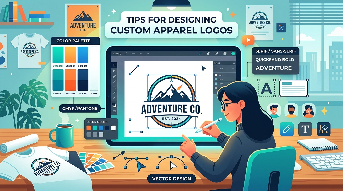
How to Design the Perfect Logo for Custom Apparel Printing
Learn the essential tips and best practices for designing a custom logo that looks amazing when printed on t-shirts, hoodies, and more.
Fast Apparel AI Generated
Designing a logo for a website is one thing; designing a logo that will be printed on thousands of t-shirts is an entirely different ballgame.
When your logo is transitioning from a glowing digital screen to a physical piece of fabric, there are specific rules you need to follow to ensure it looks crisp, vibrant, and professional. Whether you are using DTF (Direct-to-Film) printing or traditional screen printing, these tips will help you create the perfect custom apparel logo.
1. Start with Vector Graphics
The golden rule of apparel design is to use vector graphics whenever possible. Programs like Adobe Illustrator or CorelDRAW create vector files (like .AI, .EPS, or .SVG) which use mathematical equations to draw shapes.
This means you can scale your logo up to fit on a massive hoodie or scale it down for a tiny left-chest placement without losing any quality or getting pixelated. If you must use raster images (like .PNG or .JPEG), ensure they are high-resolution—at least 300 DPI (dots per inch) at the actual print size.
2. Understand Your Printing Method
How you design your logo should be heavily influenced by how it will be printed:
- For Screen Printing: Keep your colors limited. Since each color requires a separate screen (which costs money), a 1 to 3 color logo is ideal. Avoid complex gradients or drop shadows, as these are difficult to reproduce accurately with screen printing.
- For DTF Printing: Go wild! DTF printing can handle unlimited colors, complex gradients, and photorealistic details. You don't have to worry about color counts, making it perfect for modern, highly-detailed logos.
3. Think About the Garment Color
A logo that looks fantastic on a white background might completely disappear on a black t-shirt.
Always design with the final garment color in mind. If your logo has dark elements, you may need to add a white stroke or outline so it pops on dark fabrics. Conversely, if your logo has white text, it will need adjustments to work on lighter colored shirts. Providing both a "light mode" and "dark mode" version of your logo to your print shop is a pro move.
4. Avoid Super Fine Lines
While modern printing technology is incredible, there are still physical limits to how ink applies to fabric. Extremely fine lines or tiny text can get lost in the weave of the fabric or break off during washing.
Make sure your fonts are legible and that any lines in your design have enough thickness to hold up to the printing process. As a general rule, if you have to squint to read it on a computer screen, it won't be readable on a t-shirt from 5 feet away.
5. Convert Text to Outlines
Before you send your final design to your print shop, always convert your text to outlines (or curves). If you use a custom or rare font and don't outline it, the print shop's software might substitute it with a default font, completely ruining your design. Outlining the text turns it into a vector shape, ensuring it looks exactly as you intended.
Ready to Print?
By following these guidelines, you'll ensure your custom apparel looks just as good in real life as it does on your screen.
Have your logo ready to go? At Fast Apparel, our high-quality DTF printing process can bring even the most complex designs to life with brilliant colors and incredible durability. Get a Free Quote Today!
Ready to start your project?
Get a free quote and digital mockup in 24 hours. No pressure, low minimums on DTF.


